

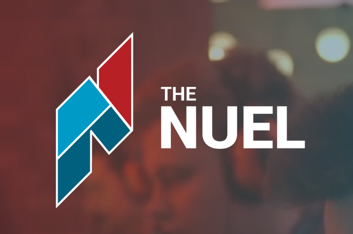
The National University Esports League runs competitive video game tournaments for students. Its logo had become unwieldy. The size and shape of the logo made it difficult to integrate in products. Our players referred to us exclusively by our initialism. The logo was well-liked, but partners considered it too stiff for a community, student-based platform for video games.
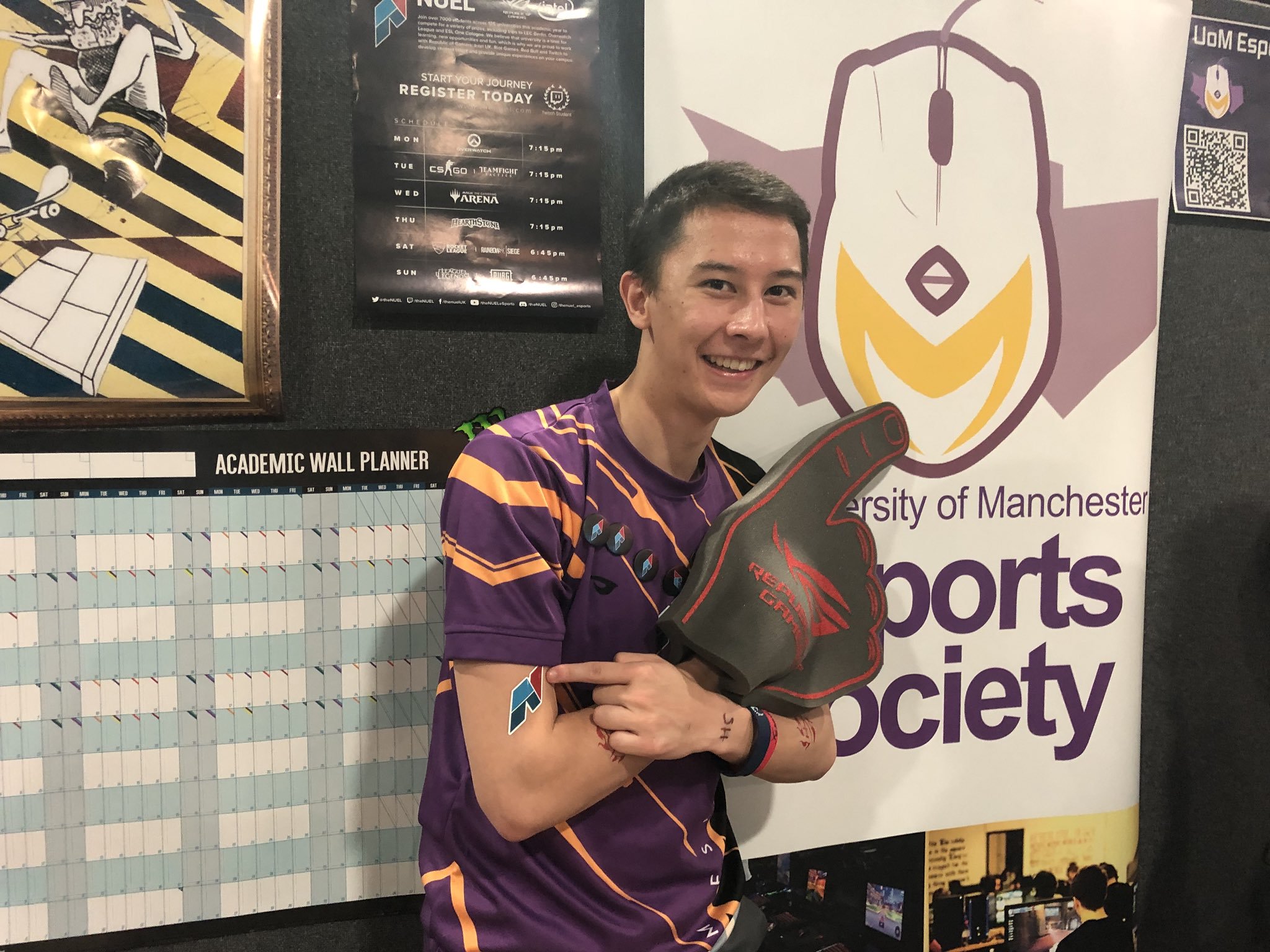
As the sole designer, I rebranded The NUEL, which consists of the main logo, logotype, auxiliary branding, and design guidelines. I also created the first six months of rebranded digital, print, and broadcast graphics for the company. The logo was well-received by the community and eventually trademarked. Every year, I see new applications of the logo: animated, embroidered on a sweatshirt, or on partner's flyers advertising university esports.
Rebrand
The player interviews revealed the they liked that The NUEL was professional, non-gamery and had fostered a welcoming community. The rebrand keeps its basic geometric feel, parallel lines, and similar colors. The sans serif was updated to reflect the website's previous year switch to Roboto and keep things clean.
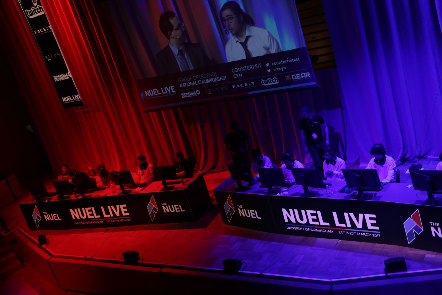
I added outlines to the logo in order to combat color degradation and blending I had experienced with the previous logo. I also created an outline logo for very dark backgrounds (a frequent use case on loading screens and photos of dark stages).
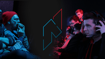
Applications
How it started How it's going pic.twitter.com/yDk3rT0HLE
— Amazon University Esports | The NUEL (@theNUEL) October 12, 2020