Federal Aviation Administration
National Airspace System
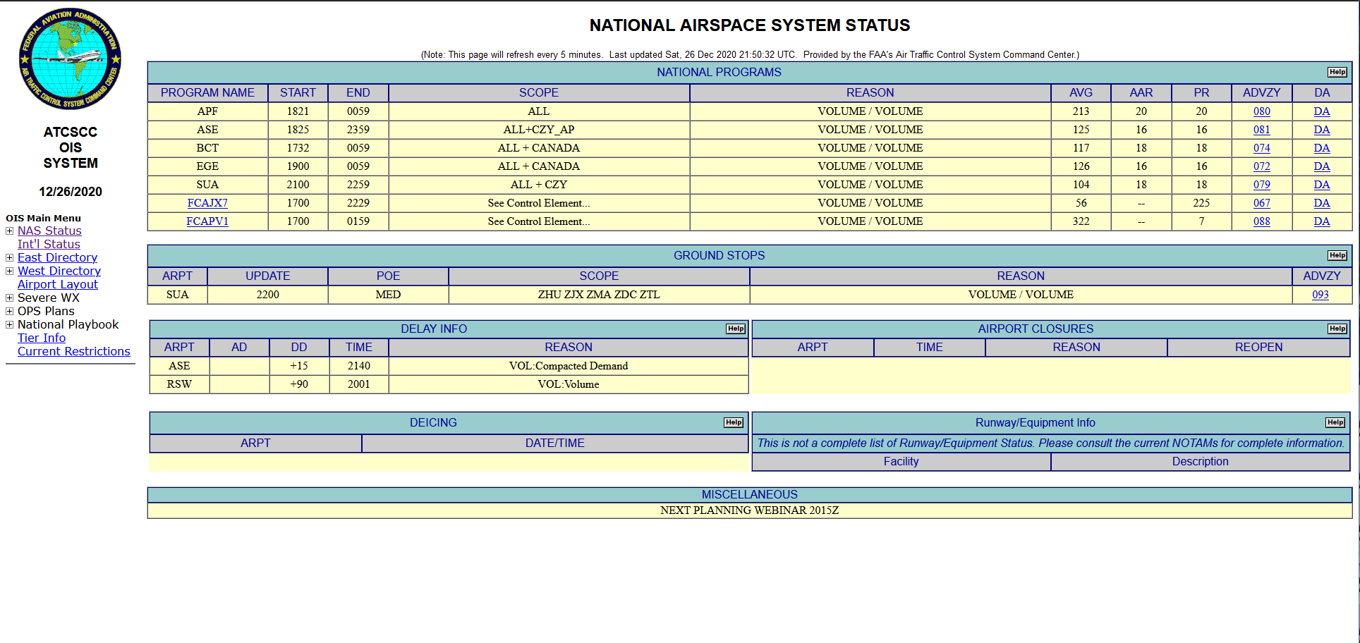
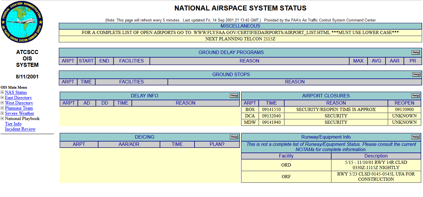
In 2020, I led design for the FAA’s first-ever product team, delivering NAS Status—the modern replacement for the legacy OIS dashboard—in under six months. OIS, a mainframe-based system restricted to two updates per year, suffered from critical technical debt. Our iterative approach drove immediate adoption, prompting the FAA to fund additional product teams and retire OIS by 2022.
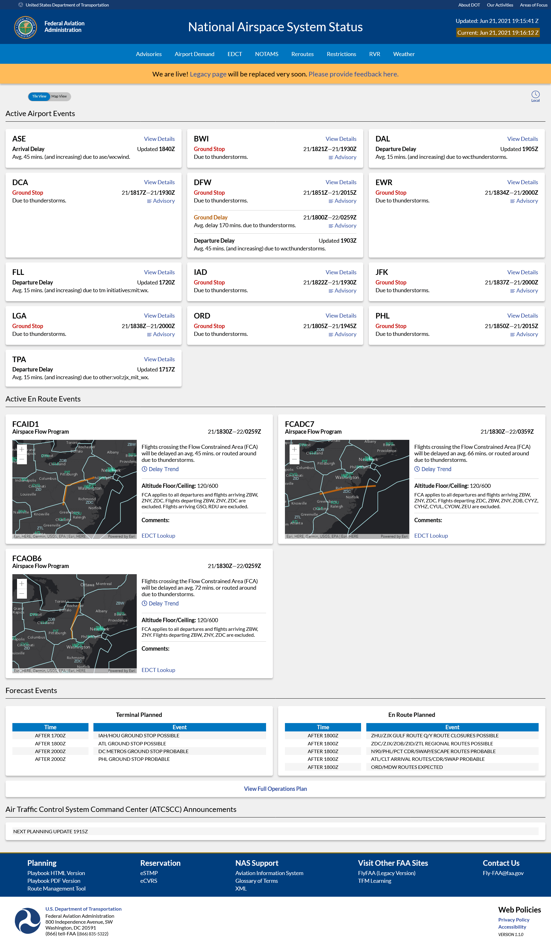
National Airspace System Status ↗ (Beta)
Context: Old Systems, Event Streams & Publicity
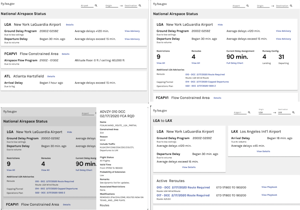
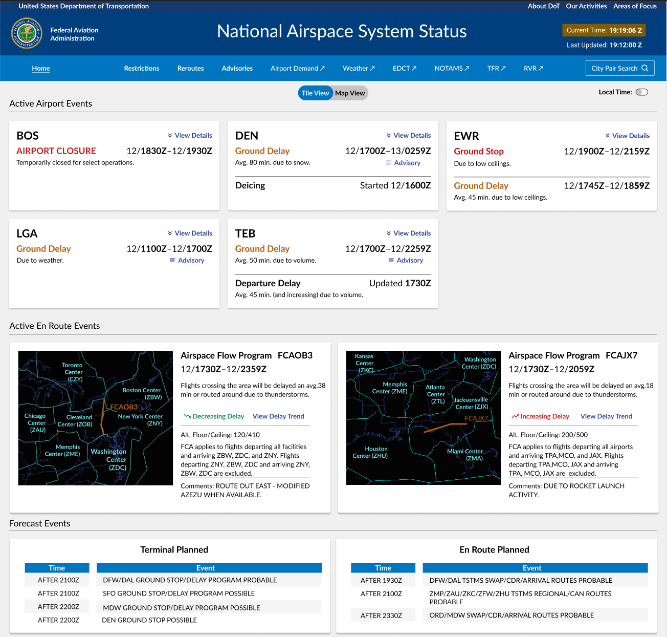
OIS displays real-time events that cancel or delay flights. While the FAA targeted the general public, our research revealed that OIS users are actually Business Aviation (BA) professionals—pilots and schedulers of private jets. Unlike airlines, BA operations are flexible, making the depth of OIS critical for last-minute flight preparation.
User Research & Prioritization
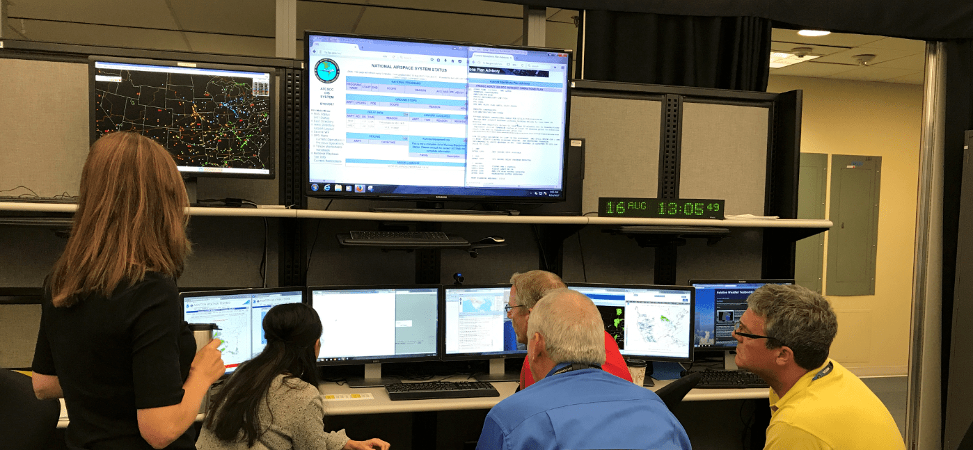
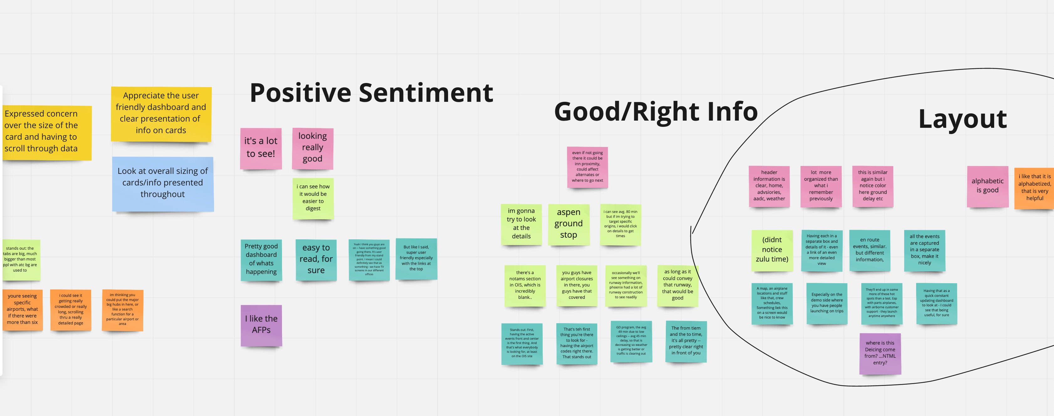
We interviewed 10 BA professionals in two weeks to understand their workflows. Schedulers initially resisted change, claiming they could "glance at the tables and know what’s going on." However, observation told a different story: users struggled with buried information, obscure navigation, and technical acronyms.
Pilots faced additional hurdles. OIS displayed poorly on the tablets and phones used in the cockpit. They needed a way to translate flight delays into "intelligent-sounding" updates for their clients, but lacked the visual graphics to interpret the direction or intensity of airborne events.
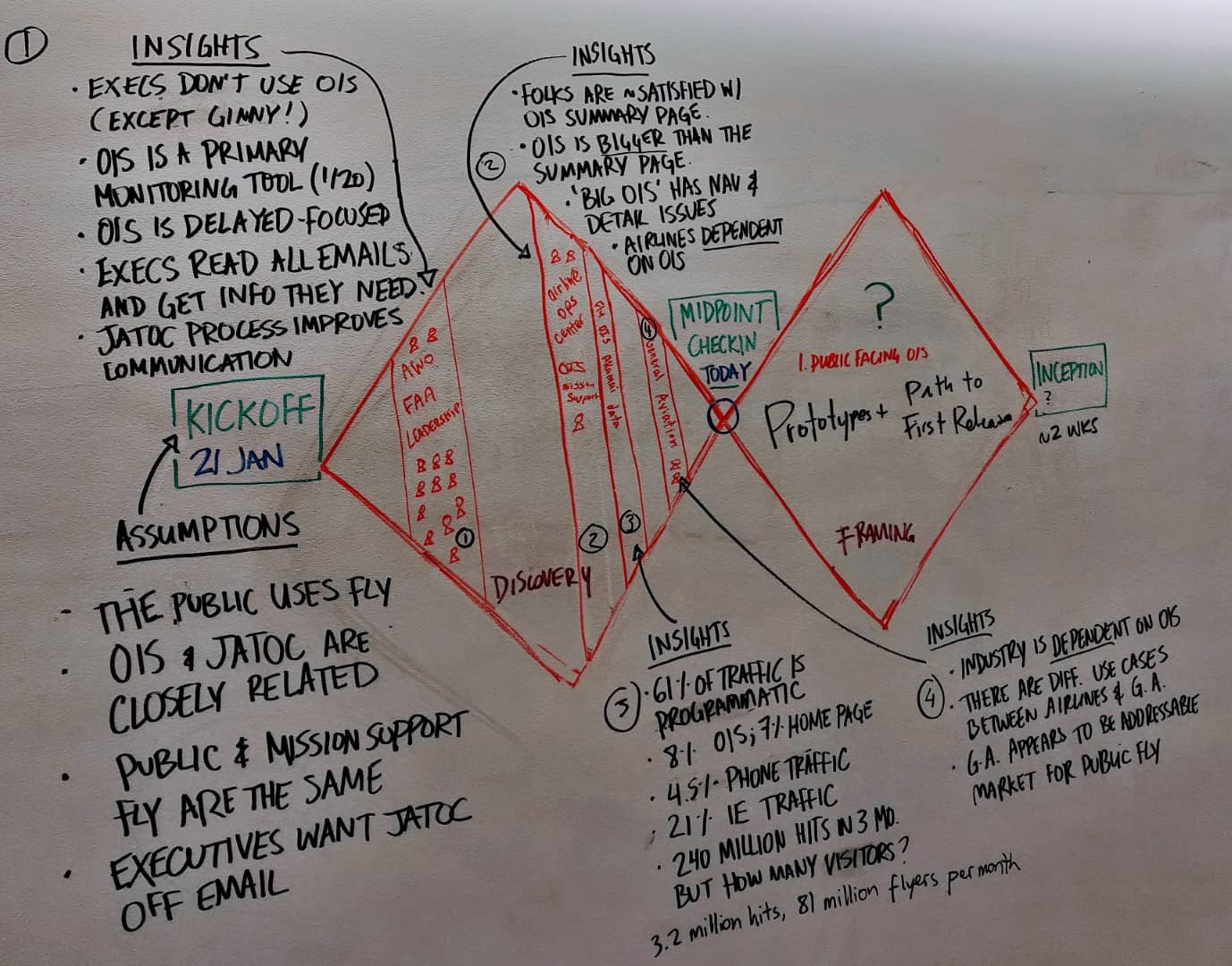
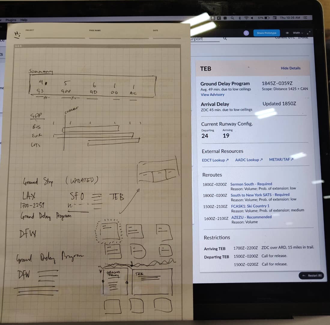
Prototyping Progress
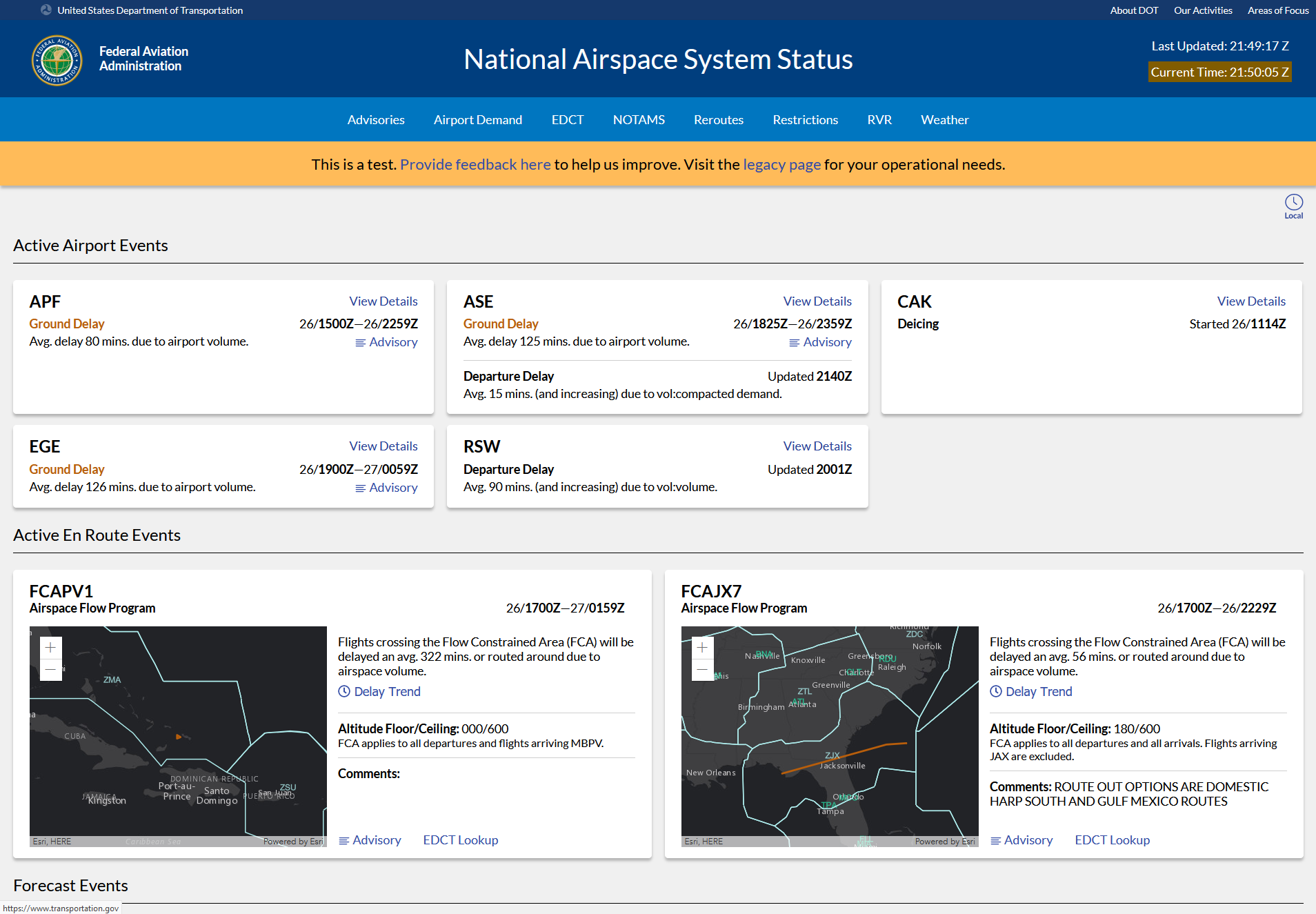
We hypothesized that a dashboard grouped by airport—rather than event type—would streamline decision-making. Our first prototype failed; users found the granularity confusing and missed the familiar tables. We pivoted, iterating through eight rounds of research with 50 users to find the right information density.
By surfacing weather maps, advisories, and real-time runway data previously hidden in other apps, we convinced skeptical power users that the increased situational awareness outweighed the change in layout. Schedulers and pilots eventually shifted from "hunting" for info to using NAS Status as their primary dashboard.
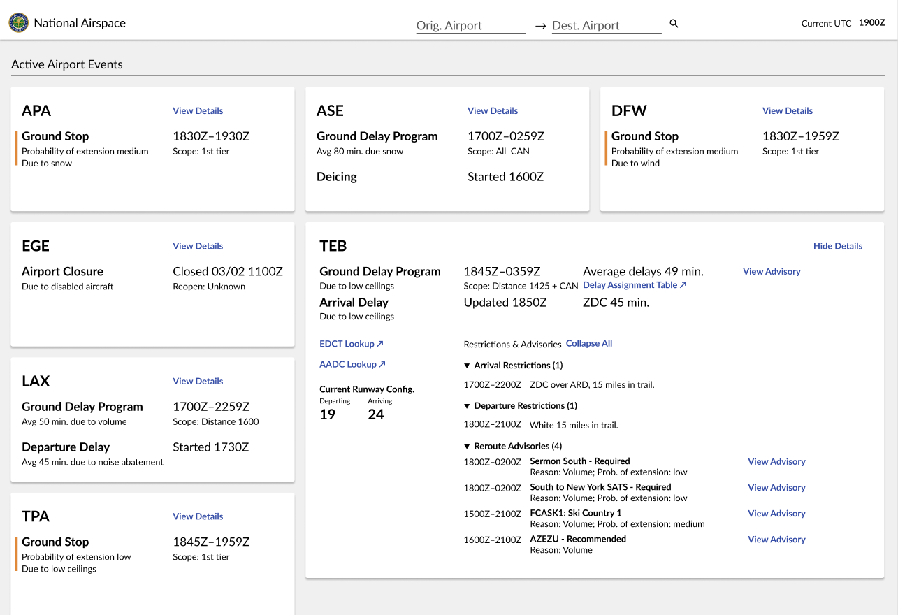
In our final release, we added a new header with internal links to reduce bookmark dependency and brought the operations plan to the front page so users could cross-check current events against future forecasts.
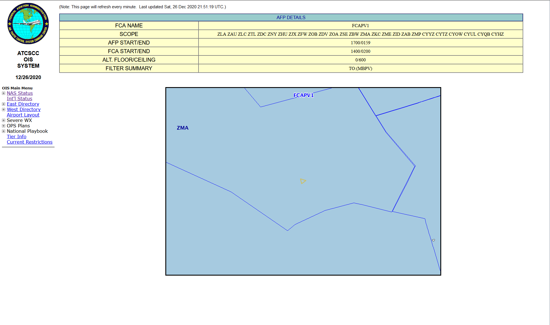
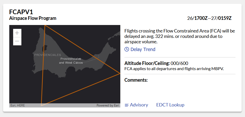
Designing Around the Data
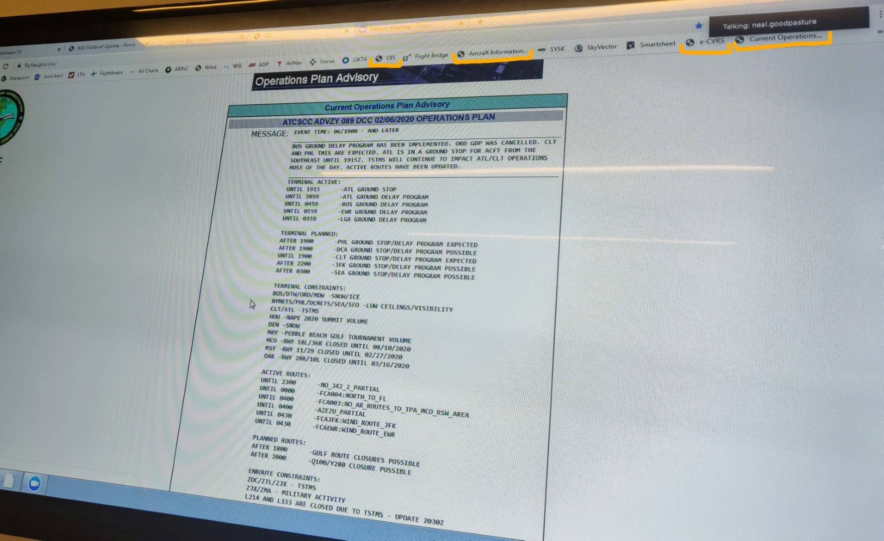
Legacy FAA data is often obscured by flight control jargon. I focused on translating complex "Flow Control" events (FCAs) into human-readable language. In the legacy system, only 5% of users understood events like FCAPV1. By introducing interactive maps and clear terminology, we enabled pilots and schedulers of all experience levels to pinpoint and plan for airborne delays effectively.