Dick's Sporting Goods
My Account & Loyalty Programs
By instituting weekly in-store research, I helped launch a tested loyalty program with clear milestones, cheaper benefits, and a better logged-in online experience.
DSG wanted a Gold membership to reward high-spending customers and motivate others to reach this tier. They needed Marketing + Product to work together to deliver a consistent retail and digital Gold experience.
I worked as a Pivotal Labs consultant on DSG's My Account team, teaching two DSG designers user-centered design practices.
Throughout the six-month engagement, I adapted user research to the needs and context of the organization. By establishing a weekly user interview cadence, I was able to use research to:
- quickly derisk and validate product initiatives
- improve digital products week-over-week
- make cross-team decisions using synthesis as common ground
DICK's My Account ↗ (Requires Account)
Context
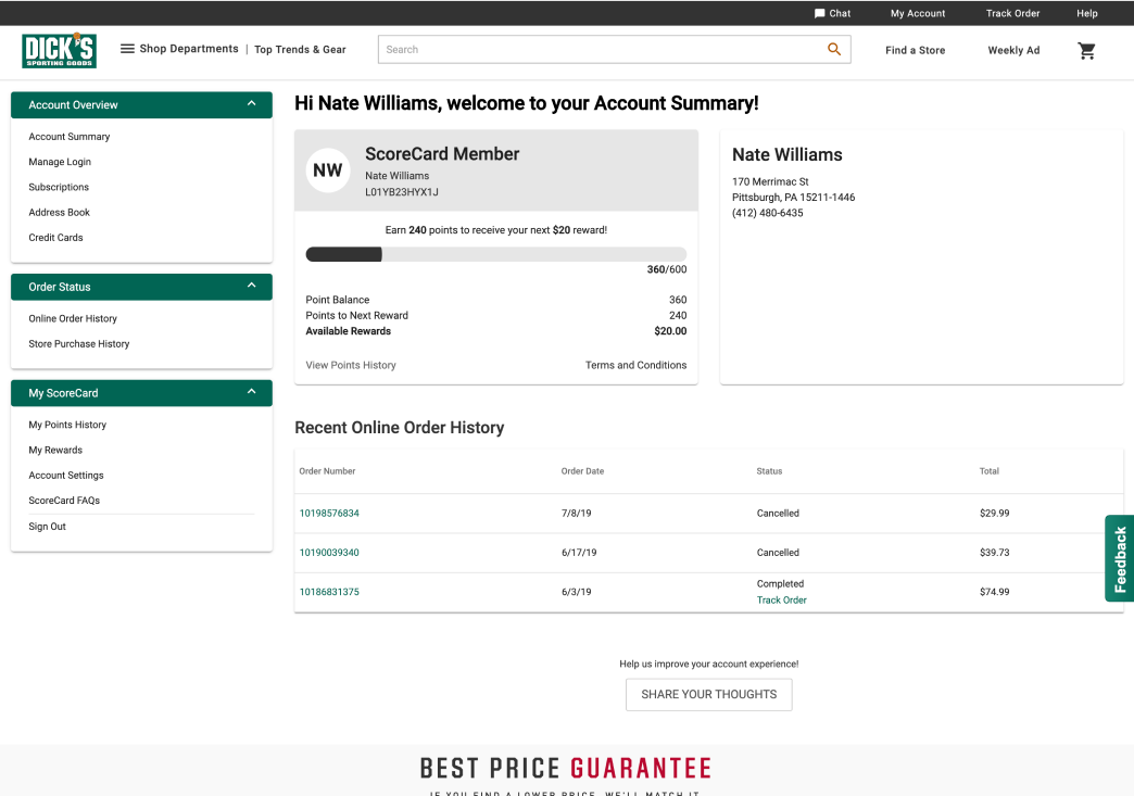
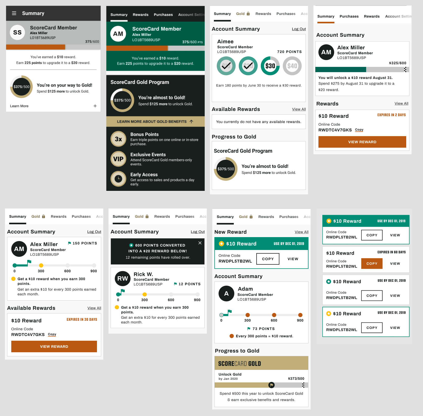
With the Dick's ScoreCard loyalty card, customers earn $10 in rewards for every $300 spent. These rewards can be tracked and obtained by email, physical mail, and online via the user's My Account page.
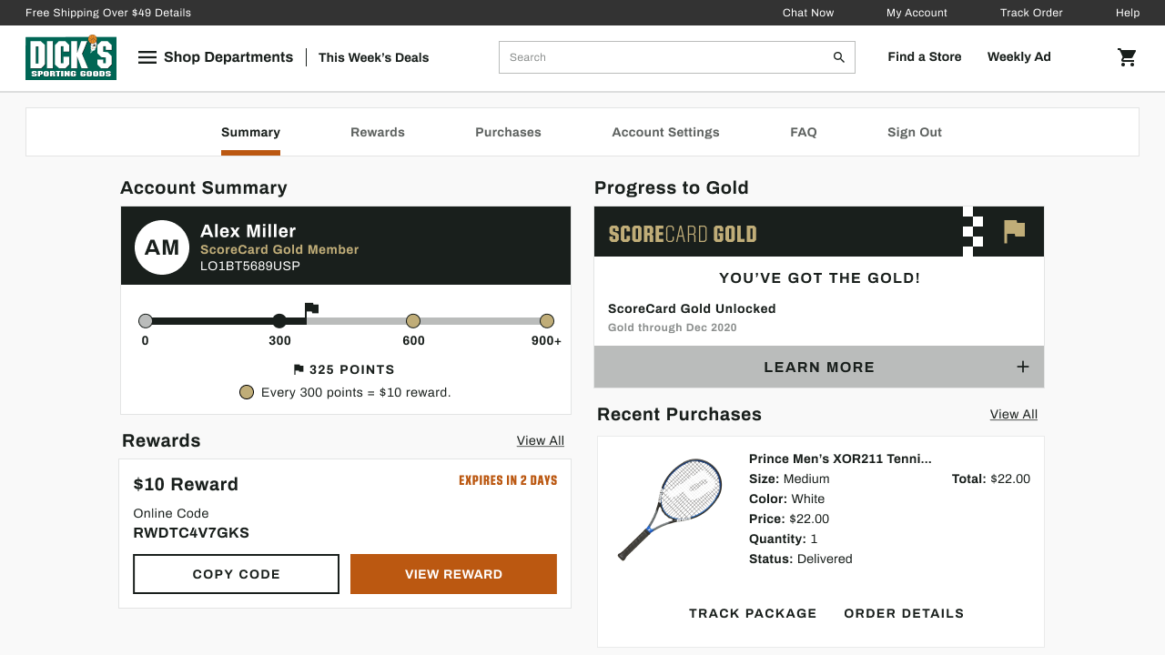
For the past two years, Marketing had worked on ScoreCard Gold, a loyalty tier for customers who spend over $500 in a year. It would include triple points days, exclusive free Pro Services (eg. tennis racket restringing), and exclusive events. Based on positive in-store trials, Marketing asked our My Account team to launch Gold online nationally by November 2019.
Derisking Through User Research
The My Account team did not have consistent methods to get user feedback about the page or ScoreCard Gold. In the first week, I organized 2x/week DSG store visits, where the full team learned how to run customer interviews. I also worked with the PMs to create a "Share Your Thoughts" footer link to passively gather Qualtrics feedback.
In the engagement's first 2 weeks, we interviewed 41 customers, 11 store employees, 5 "best customers," and received 350 Qualtrics responses. We asked broad questions around DSG and loyalty programs.
Dick's shoppers liked the brand's quality and range. But we found they were apathetic towards the ScoreCard. They had no sense of why or when they were receiving rewards. They often equated them with promotional coupons. Nobody we talked to had ever used a Pro Service.
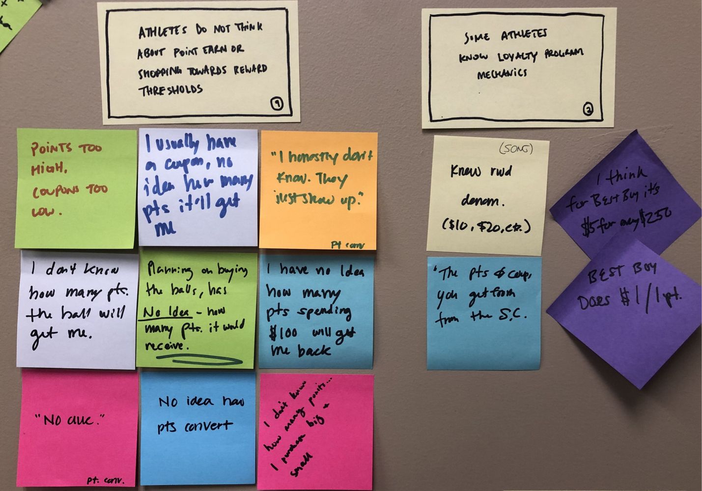
Maybe users weren't familiar with the term "Pro Services" or used "coupon" to mean "reward." In the second week, we listed out all Pro Services and asked about interest. Just 15% had used a pro service in the last year, all at the initial point of purchase. We asked customers what coupons they used; 75% of those who spent over $300 were using basic %-off or brand coupons. Critically, they didn't remember receiving or using $10 rewards at any point.
2 weeks of research proved regular and high-spending shoppers had low appetite for Pro Services. As an informed product team, we pushed back on the Pro Services Gold reimbursement plan Marketing wanted. We instead prioritized a better online progress and delivery system for ScoreCard and Gold because of the confusion and passivity we heard in interviews. There was also business value in getting users to track their progress to Gold ($500): customers who reached Gold were more likely to return and make larger purchases at higher margins.
100% Committed
The My Account team was reluctant to do regular user research. The team was unsure if in-store insights would translate to ecommerce. Our client PM worried about the productivity hit and the optics of being absent once a week.
I pitched regular user research as our weekly grounding point. If Wednesday is our store visit day, then we can plan our entire week around it and reduce cognitive load. The PMs know user research + synthesis (Wednesday + Thursday) creates new stories and priorities, which they can work on Friday and Monday. Designers and PMs prepare for research on Tuesday and the cycle repeats. We are not absent, but doing our expected Wednesday store research.
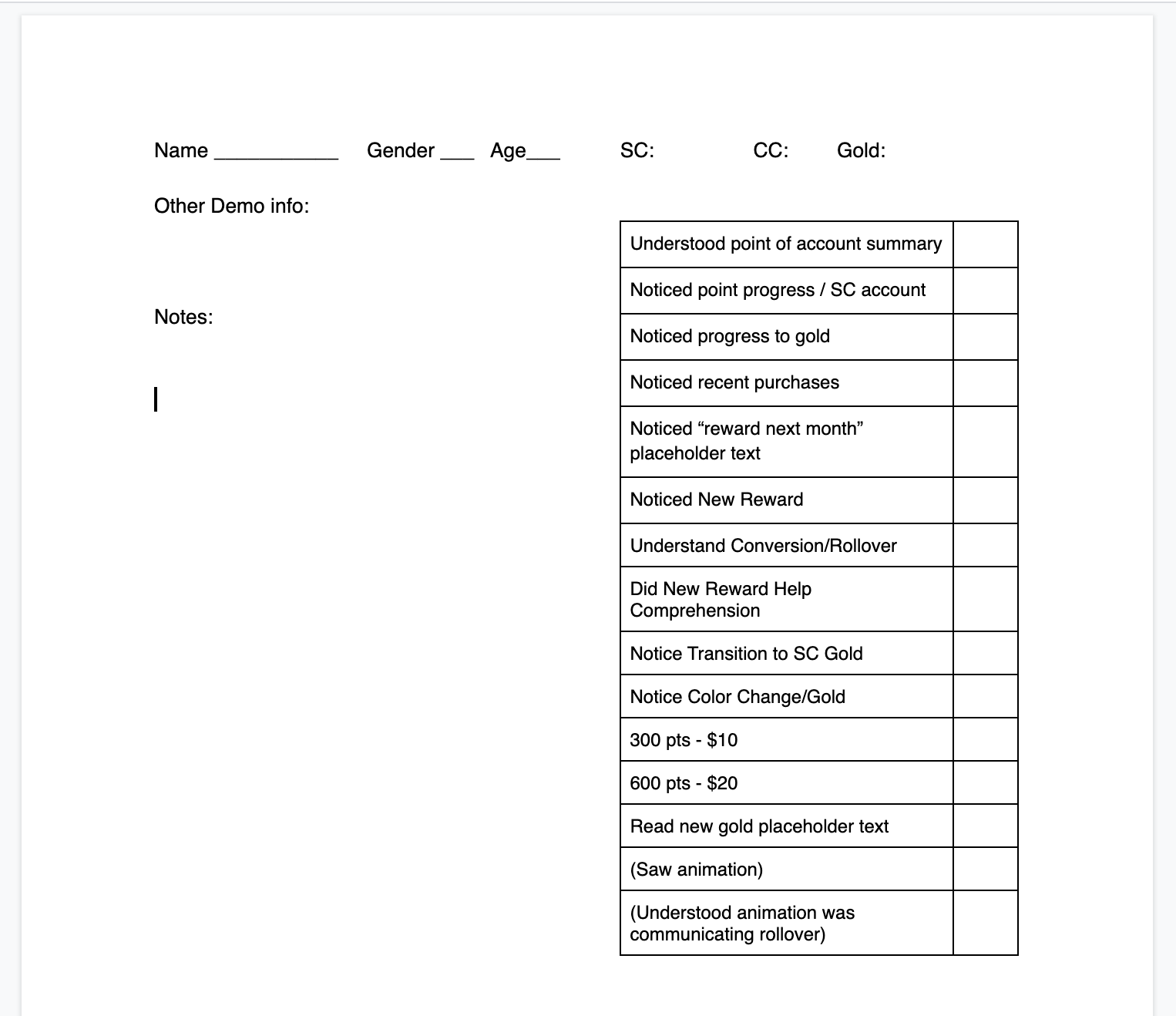
July onward, we ran 14 tests in 12 weeks (two twice-in-a-week) sessions with 145 users. Our main hypothesis: if we can explain ScoreCard points progress to customers, they will be willing to shop more often and hit their 300/500 point targets.
I had to adapt standard interview into a fast and approachable experience to suit our in-store users. I started handing users our cell phone (instead of asking them to visit a link) to reduce setup friction. Users were distracted by an active notetaker with a clipboard, so we simply observed the interviews and used a template to record what they did immediately after the test.
Sometimes our design ideas fell flat. It was clear within the first two interviews when, for example, users didn't care about a specific perk or missed too-subtle notifications. Unlike previous engagements with specific users, we could simply iterate on the design in-store and find new DSG shoppers to test with.
We sometimes tested our same in-store research plan on UserTesting.com with ecommerce customers as a control. We found the feedback was the same, just more expensive to recruit.
After the Pivotal engagement, the client designers have continued the cadence, averaging 8 user interviews a week.
Enabling Partners
When we said "don't do Pro Services and focus on ScoreCard communication," both marketing and ecommerce stakeholders were concerned. We were talking to too few users, not making data-driven decisions, just doing what our users said: creating friction in a two-year project.
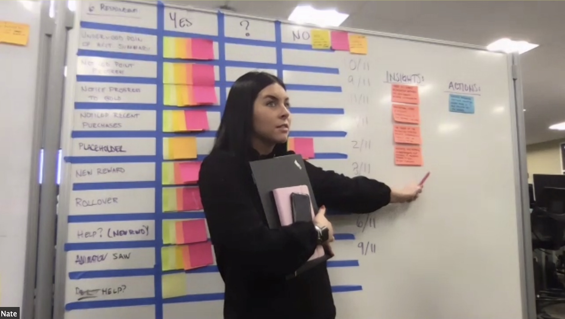
We made it clear we wanted to create Gold online, but not complex features with no leading indicators. I collaborated with my product manager to present the rigor and data behind user research to our stakeholder team in the below presentation. We impressed that user research is only one part of the feedback process that evolves into behavioral metrics and web-based testing. That said, it was the cheapest, fastest way to gauge customer interest and make evidence-based decisions.
We saw an opportunity to put our talk into action and bring the marketing team into our new weekly research cadence.
Team Sport Research
We brought the user research synthesis to the Marketing floor. There, they participated by recounting the user interview, tying findings to new and existing insights, and shaping the next iteration's priorities. We baked metrics into our research to help Marketing + Product make data-driven decisions.
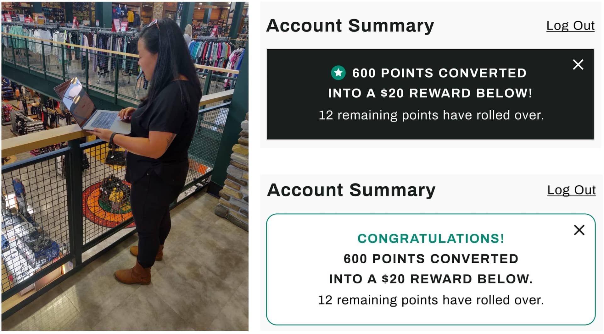
A marketing team member came up with the idea of animating the points progress bar, which brought us from a ~60% user comprehension rate to 90+%. We showed users three sequential states:
- I'm on my way to a reward
- I will earn a reward soon
- and my points have been converted into a reward
and asked them to explain what was happening on screen. See the prototype video below!
With marketing excited about the next round of user research, we had the buy-in to drop expensive Gold features and continue exploring the ScoreCard points progression. We invited designers from the Mobile App and External Communications to take part in store research. I led all three teams in a design studio to agree on a unified look, feel, and dictionary for ScoreCard Gold that could be replicated on web, app, and emails.
Outcomes
By doing quick, iterative user research, we were able to prove that several Gold membership perks, like Pro Services, did not resonate with users. We instead focused on communicating points progression and rewards earned. By involving marketing in our synthesis, we were able to make decisions with user research as our common ground. We convinced them to drop the least valuable perks and aligned on how points looked and felt across mediums. Our guerilla in-store research got us quick, quantifiable insights into what resonated and didn't. As we got other departments and product teams invested in the research outcomes, it was easier to make the My Account team comfortable with regular user research.